Difference between emboss and deboss often confuses people when they see printed logos, book covers, or business cards with raised or pressed designs. You may have noticed this on wedding cards or luxury packaging.
A student designing a school project might wonder why some logos feel raised while others look pressed inward. That simple visual difference leads to the question: what is the difference between emboss and deboss?
Many beginners use these terms interchangeably, but they describe two different printing and design techniques. Understanding the difference between emboss and deboss helps learners communicate clearly in design and printing tasks.
For students, bloggers, designers, and content writers, knowing this difference improves vocabulary and technical clarity. Now let’s explore how these two terms differ in a clear and practical way.
Key Difference Between the Two
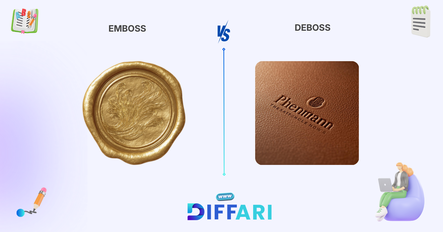
The key difference between emboss and deboss lies in how the design appears on a surface.
Emboss creates a raised design that stands out from the surface.
Deboss creates a pressed or sunken design that goes into the surface.
In simple words, emboss pushes the design upward, while deboss pushes the design downward.
Emboss gives a bold and noticeable look.
Deboss gives a subtle and elegant look.
Both techniques are common in printing, packaging, book covers, logos, and branding materials.
Why Is Their Difference Necessary to Know
Understanding the difference between emboss and deboss is important for both learners and professionals.
Students need this knowledge to understand design vocabulary and improve communication in creative projects. When they use correct terms, teachers and peers understand their ideas easily.
Professionals in printing, publishing, and branding must know the difference to deliver accurate results. A small mistake in terminology can lead to wrong printing output and extra cost.
In society, visual communication plays a big role in marketing and branding. Companies use emboss and deboss to create attractive packaging and premium product designs.
Knowing this difference helps people choose the right technique for the right purpose. Now let’s understand how these words are pronounced.
Pronunciation
Emboss
US: /ɪmˈbɔːs/
UK: /ɪmˈbɒs/
Deboss
US: /diːˈbɔːs/
UK: /diːˈbɒs/
Both words sound similar, which often creates confusion. Understanding pronunciation makes it easier to recognize them in conversations and presentations.
Now let’s look at the core definitions to build a strong foundation.
Core Definitions
Emboss
Emboss is a printing or design technique that creates a raised image or text on a surface. It pushes the material upward to form a visible and touchable design. The tone often feels premium and decorative.
Example:
The company embossed its logo on the business card.
Deboss
Deboss is a printing or design technique that presses an image or text into a surface. It pushes the material downward to create a sunken design. The tone feels subtle and elegant.
Example:
The designer debossed the brand name on the leather cover.
10 Clear Differences Between Emboss and Deboss
1. Surface Direction
Emboss pushes the design upward from the surface.
Deboss pushes the design inward into the surface.
Example for Emboss:
The logo rises above the paper.
Example for Deboss:
The logo sinks into the leather.
2. Visual Appearance
Emboss looks bold and noticeable.
Deboss looks subtle and clean.
Example for Emboss:
The wedding card shows a raised golden pattern.
Example for Deboss:
The notebook shows a pressed logo.
3. Touch and Feel
Emboss creates a raised texture you can feel easily.
Deboss creates a pressed texture that feels smooth around the edges.
Example for Emboss:
You can feel the raised brand name.
Example for Deboss:
You can feel the pressed design on the cover.
4. Design Impact
Emboss creates a strong visual impact.
Deboss creates a soft and elegant impact.
Example for Emboss:
The company wants a bold logo.
Example for Deboss:
The company wants a minimal design.
5. Usage in Packaging
Emboss is often used in luxury packaging and greeting cards.
Deboss is often used in leather goods and premium notebooks.
Example for Emboss:
Perfume boxes use embossed branding.
Example for Deboss:
Leather wallets use debossed logos.
6. Light and Shadow Effect
Emboss reflects light and creates shadows around the raised design.
Deboss creates shadows inside the pressed area.
Example for Emboss:
Light highlights the raised text.
Example for Deboss:
Shadow forms inside the pressed logo.
7. Printing Technique
Emboss uses pressure to raise the material.
Deboss uses pressure to press the material inward.
Example for Emboss:
The machine lifts the design.
Example for Deboss:
The machine presses the design.
8. Common Industry Use
Emboss is common in branding and logos.
Deboss is common in leather and premium products.
Example for Emboss:
Company logos on certificates are embossed.
Example for Deboss:
Luxury diaries use debossing.
9. Style Preference
Emboss suits bold and decorative styles.
Deboss suits minimal and modern styles.
Example for Emboss:
A luxury invitation uses embossing.
Example for Deboss:
A modern journal uses debossing.
10. Overall Impression
Emboss gives a strong and premium impression.
Deboss gives a calm and elegant impression.
Example for Emboss:
The raised logo attracts attention.
Example for Deboss:
The pressed logo looks classy.
🎯 Why Knowing the Difference Matters
Understanding the difference between emboss and deboss helps students use correct design vocabulary in assignments and presentations. It improves clarity and builds confidence in technical communication.
Professionals in printing, packaging, branding, and graphic design must know this difference to avoid costly mistakes. Choosing emboss instead of deboss can completely change the final product look and feel.
In social and business communication, correct terminology builds trust and credibility. Clients and teams respect professionals who use precise design language and explain concepts clearly.
Real‑World Consequences of Confusion
If a designer requests emboss instead of deboss, the printing company may produce the wrong design. This wastes time, money, and materials.
A branding project can lose its premium look if the wrong technique is used. Clear understanding prevents errors and ensures quality results.
🧠 Why People Get Confused
Similar Spelling
Emboss and deboss look very similar in spelling. The only difference is the prefix em- and de-, which makes learners mix them easily.
Similar Pronunciation
Both words sound alike in conversation. This creates confusion in meetings and classroom discussions.
Semantic Overlap
Both words belong to printing and design vocabulary. They also describe surface texture, which makes their meanings overlap in context.
Influence of Informal Speech
In casual speech, people often use emboss to describe both techniques. This informal usage spreads confusion among beginners.
🎭 Connotation & Emotional Tone
Connotation = emotional meaning attached to a word.
Connotation (bold) = the emotional meaning associated with a word.
Emboss
Positive:
Emboss often suggests luxury and premium quality.
Example: The embossed logo gives a rich look.
Negative:
Sometimes emboss may look too bold or flashy.
Example: The embossed design looks heavy.
Neutral:
It simply describes a raised surface technique.
Example: The book cover is embossed.
Deboss
Positive:
Deboss suggests elegance and minimalism.
Example: The debossed logo looks classy.
Negative:
It may look less visible or subtle.
Example: The debossed text is hard to see.
Neutral:
It describes a pressed design into a surface.
Example: The leather cover is debossed.
🗣 Usage in Metaphors, Similes & Idioms
These words rarely appear in traditional idioms, but they can be used in modern metaphors.
Emboss metaphor:
His achievements are embossed in history.
This means his achievements stand out clearly.
Deboss metaphor:
The memory was debossed into her mind.
This means the memory was deeply impressed.
These creative uses add expressive power to writing.
📊 Comparison Table
| Feature | Emboss | Deboss |
|---|---|---|
| Meaning | Raised design | Pressed design |
| Tone | Bold and premium | Subtle and elegant |
| Usage | Logos, cards, packaging | Leather, notebooks, covers |
| Context | Branding and decoration | Minimal design |
| Formality | Technical design term | Technical design term |
⚖️ Which Is Better in What Situation?
When to Use Emboss
Use emboss when you want a bold and eye-catching design. It works well in logos, wedding cards, certificates, and luxury packaging. Raised surfaces attract attention and create a premium feel.
When to Use Deboss
Use deboss when you want a subtle and elegant appearance. It suits leather products, journals, and modern branding. Pressed designs create a clean and sophisticated look.
Situational Clarity
Emboss fits decorative and bold projects. Deboss fits minimal and modern designs. The choice depends on visual goals and brand identity.
Contextual Correctness
In printing and design discussions, always choose the correct term based on surface direction. This ensures accurate communication and better results.
📖 Literary or Cultural References
Book Reference
The Design of Everyday Things (Non-fiction, Don Norman, 1988)
This book explains how physical design and texture influence user experience. Techniques like emboss and deboss reflect how design affects perception.
Movie Reference
Helvetica (USA, 2007)
This documentary explores typography and design. It indirectly highlights printing techniques and visual presentation methods like emboss and deboss.
❓ FAQs
1. What is the main difference between emboss and deboss?
Emboss creates a raised design on a surface, while deboss creates a pressed or sunken design. The difference depends on surface direction and visual effect. Emboss stands out, while deboss goes inward. Both techniques are used in printing and packaging.
2. Is emboss more expensive than deboss?
In many cases, emboss and deboss have similar costs because both require special dies and pressure. The final cost depends on material, size, and design complexity. Premium materials increase production cost.
3. Where is emboss commonly used?
Emboss is commonly used in wedding cards, certificates, book covers, and luxury packaging. It creates a bold and premium look. Many brands use emboss to highlight logos and titles.
4. Where is deboss commonly used?
Deboss is popular in leather products, journals, notebooks, and minimalist packaging. It creates a subtle and elegant effect. Many luxury brands prefer deboss for modern design.
5. Can emboss and deboss be used together?
Yes, designers sometimes combine emboss and deboss in the same project. This creates layered textures and unique visual effects. However, it requires careful planning and precision.
🏁 Conclusion
The difference between emboss and deboss lies in surface direction, visual effect, and design purpose. Emboss raises the design, while deboss presses it inward to create a refined look.
Understanding this difference helps students, designers, and professionals communicate clearly and choose the right technique for printing and branding projects.
Clear knowledge of emboss and deboss prevents costly mistakes and improves design accuracy in real-world applications.
Keep practicing these terms in design discussions and technical writing. With regular use, you will confidently apply emboss and deboss in the correct context and enhance your communication skills ✨
Sajid Ali is an English language educator and content specialist with 7+ years of teaching experience. He holds master’s degrees in Information Technology and Education from the Virtual University of Pakistan and writes SEO-optimized, learner-friendly vocabulary content for diffari.com.